

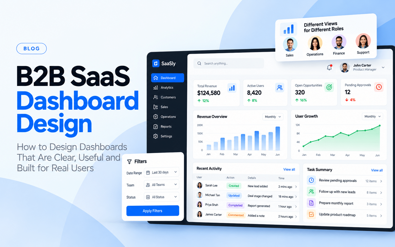
B2B SaaS products often have a difficult UX problem: they need to present a large amount of information without overwhelming the people using it. A business dashboard may contain metrics, charts, tables, filters, alerts, reports, workflows, and account information on the same platform. Different users may also have different responsibilities and permissions. This makes dashboard design very different from designing a simple consumer application.
A successful B2B dashboard is not created by adding more charts or reducing the amount of information. The information needs to be structured around what users actually need to understand and do.
What Is B2B Dashboard Design?
B2B dashboard design is the process of structuring the interface of a business application so users can understand information, monitor activity, and complete important tasks.
A dashboard may be used by:
- Sales teams
- Operations teams
- Finance teams
- Administrators
- Managers
- Customer support teams
- Product teams
Each role may need a different view of the same underlying system. For example, a sales manager may need pipeline performance and team activity, while a sales representative may need individual leads and follow-ups. The interface should reflect those differences.
Why Are B2B Dashboards Difficult to Design?
The complexity usually comes from the product rather than the interface itself. B2B applications often contain:
Large amounts of data
Users may need to compare hundreds or thousands of records.
Multiple user roles
Different people may have different permissions and responsibilities.
Complex workflows
A task may require several steps before it is completed.
Business-specific terminology
Users may already understand specialised terms that need to be reflected accurately.
Multiple states
A record can be pending, approved, rejected, completed, archived, or assigned. A dashboard needs to represent these states without making the experience difficult to understand.
Start With User Tasks, Not Widgets
One common mistake is beginning dashboard design with charts. The better starting point is the user’s task. Ask:
- What does this user need to know?
- What does the user need to do?
- How often is the task performed?
- What information is needed before the task can be completed?
- What happens when something goes wrong?
This changes the design conversation from “Which chart should we use?” to “What decision does the user need to make?” That distinction matters.
Build an Information Hierarchy
Not every piece of information deserves the same visual importance. A dashboard can be structured around three levels.
Primary Information
This is information users need immediately. Examples include revenue, active users, pending approvals, or urgent alerts.
Supporting Information
This helps users understand the primary information. Examples include trends, comparisons, historical data, and supporting metrics.
Detailed Information
This is useful when users want to investigate further. Examples include individual records, transaction details, or historical activity. The interface should allow users to move from summary to detail without forcing everything onto the first screen.
Use Progressive Disclosure
A dashboard does not need to display every available option at once. Progressive disclosure allows advanced information to appear when it becomes relevant.
For example:
Overview → Metric → Detailed report → Individual record
This structure keeps the main interface manageable while still providing access to deeper information. It is particularly useful in enterprise applications where advanced functionality cannot simply be removed.
Design Filters Around Real Questions
Filters are often added to dashboards as a functional requirement. The problem appears when users are given too many filter options.
Instead of asking:
“What filters can we provide?”
Ask:
“What questions will users ask about this data?”
For a sales dashboard, users might want to know:
- Which leads are still open?
- Which accounts have not been contacted?
- Which region is performing best?
- Which opportunities are likely to close?
The filters should support those questions.
Tables Need UX Design Too
Data tables are common in B2B software. A table can quickly become difficult to use when too many columns, actions, and states are displayed together.
Useful considerations include:
- Which columns are essential?
- Can users customise columns?
- Which information needs to remain visible while scrolling?
- How are sorting and filtering handled?
- What happens when there are no results?
- How are bulk actions presented?
- How are errors communicated?
The table should support the task rather than simply display the database.
Empty States Are Part of Dashboard UX
An empty dashboard does not necessarily mean something is wrong. A new account may have no data yet. A user may have completed all assigned tasks. A filter may return no results. Each situation can require different messaging. A useful empty state can explain:
- What happened?
- Why is the screen empty?
- What can the user do next?
This prevents confusion and reduces unnecessary support requests.
Account for Different User Roles
A B2B SaaS product may have administrators, managers, and regular users. Giving every user the same dashboard can create unnecessary complexity. Role-based experiences can help users see the information that is relevant to their responsibilities.
This does not always mean creating completely separate products. Shared components and patterns can be used while the content and permissions change based on the user’s role.
Accessibility Should Be Considered Early
Dashboard interfaces can create accessibility challenges because they often rely heavily on colour, tables, charts, and interactive controls. Designers should consider:
- Keyboard navigation
- Focus states
- Text contrast
- Form labels
- Chart alternatives
- Clear error messages
- Touch targets
- Screen-reader-friendly structures
Accessibility should be part of the design system and interaction model rather than treated as a final check.
Design Systems Become More Important as SaaS Products Grow
A SaaS platform can accumulate hundreds of screens. Without reusable components and documented patterns, small inconsistencies start appearing. Buttons may behave differently. Forms may use different validation patterns. Tables may have different interactions. A design system helps teams establish shared rules.
It can include:
- Components
- Typography
- Colour tokens
- Spacing
- Interaction patterns
- Form patterns
- Accessibility guidelines
- Documentation
The system should evolve with the product.
How to Improve an Existing B2B Dashboard
A complete redesign is not always required. Start by identifying where users struggle. Useful sources include:
- Product analytics
- Customer support tickets
- User interviews
- Usability testing
- Session recordings
- Sales-team feedback
- Customer success feedback
The highest-friction workflows can then be prioritized. Bokaap’s B2B SaaS design work focuses on SaaS platforms, dashboards, and workflow-heavy business applications where information architecture and usability are important.
Final Thoughts
Good B2B dashboard design is about helping users understand information and act on it. The interface should reflect real workflows, user roles, and business decisions. Charts, tables, and filters are only tools. The larger design problem is deciding what information users need, when they need it, and what they should be able to do with it. For growing SaaS products, this becomes even more important because complexity tends to increase as features and users are added.
FAQs
What is B2B dashboard design?
B2B dashboard design focuses on creating interfaces that help business users understand data, monitor activity and complete work within SaaS or enterprise applications.
What makes a good SaaS dashboard?
A good SaaS dashboard provides relevant information, clear hierarchy, useful workflows, understandable navigation and appropriate levels of detail.
How do I simplify a complex dashboard?
Start by identifying the user’s most important tasks. Remove or move secondary information, improve hierarchy and use progressive disclosure for advanced functionality.
What is the difference between a dashboard and a SaaS interface?
A dashboard usually provides an overview of important information and actions. A SaaS interface includes the broader product experience, including settings, workflows, records and other screens.
Why are user roles important in dashboard design?
Different roles often have different responsibilities. Role-based experiences can help each user focus on the information and actions relevant to their work.
Should every dashboard use charts?
No. Charts should be used when visualisation helps users understand a relationship, trend or comparison. Tables or other formats may be more appropriate for detailed records.
When should a B2B SaaS dashboard be redesigned?
A redesign may be considered when users struggle with important workflows, the interface has become inconsistent, the product has accumulated complexity or the current structure no longer supports user needs.