What We Did
The Client
The Social Alpha platform is designed to drive innovative solutions for bottom-of-the-pyramid challenges in India.
The Social Alpha platform is designed to drive innovative solutions for bottom-of-the-pyramid challenges in India. Its mission is to foster community-driven problem identification and validation, source global innovators tackling real, validated challenges, and efficiently deploy scarce resources to address the most critical issues.
The Brief
Social Alpha approached us to enhance their existing platform, which had evolved organically over time. While its core functionality was intact, the user experience had become fragmented. Certain tasks were unclear, actions were repeated in some areas, and others seemed irrelevant. Our role was to visually upgrade the platform and address UX inconsistencies to ensure that entrepreneurs and innovators could fully leverage its potential.
Our Approach
Prioritising the Dashboard
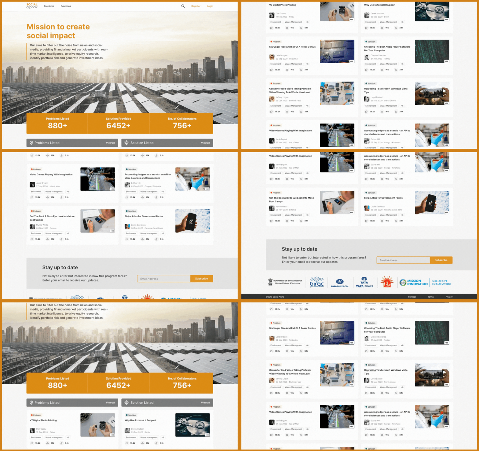
We focused on the dashboard as the primary area of user engagement, where all critical components converge. We incorporated relevant information about ongoing activities to enhance its utility, organised into scannable segments. We aimed to make the dashboard a comprehensive, intuitive space for new and existing users.
Creating a Comprehensive UI Kit
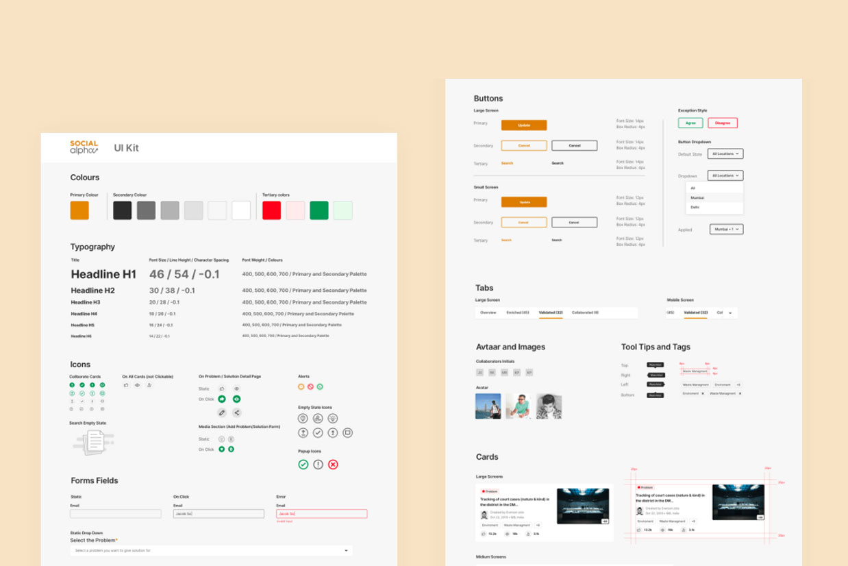
To future-proof the platform, we created a detailed library of reusable components, inspired by atomic design principles. With structured naming conventions and a cohesive UI system, Social Alpha’s team can efficiently expand the platform’s functionality as it grows.
UI Transformation
Improving Visual Hierarchy
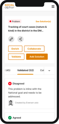
Although the platform was functional, its design felt incomplete and outdated. By refining the hierarchy of information through careful use of font sizes, colours, and whitespace, we ensured that users could access relevant details logically and effortlessly.
Streamlining Essential Actions
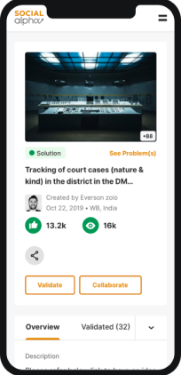
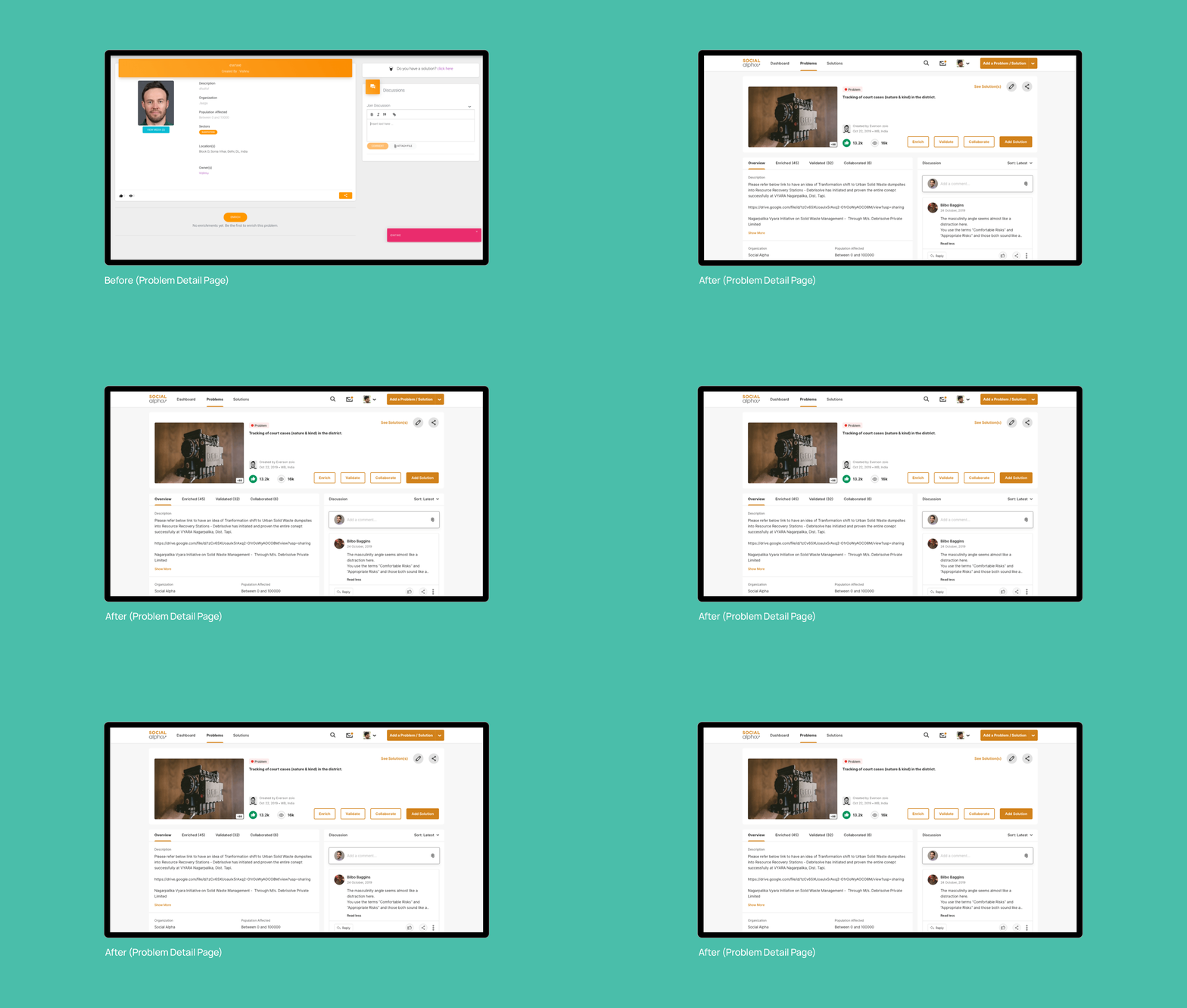
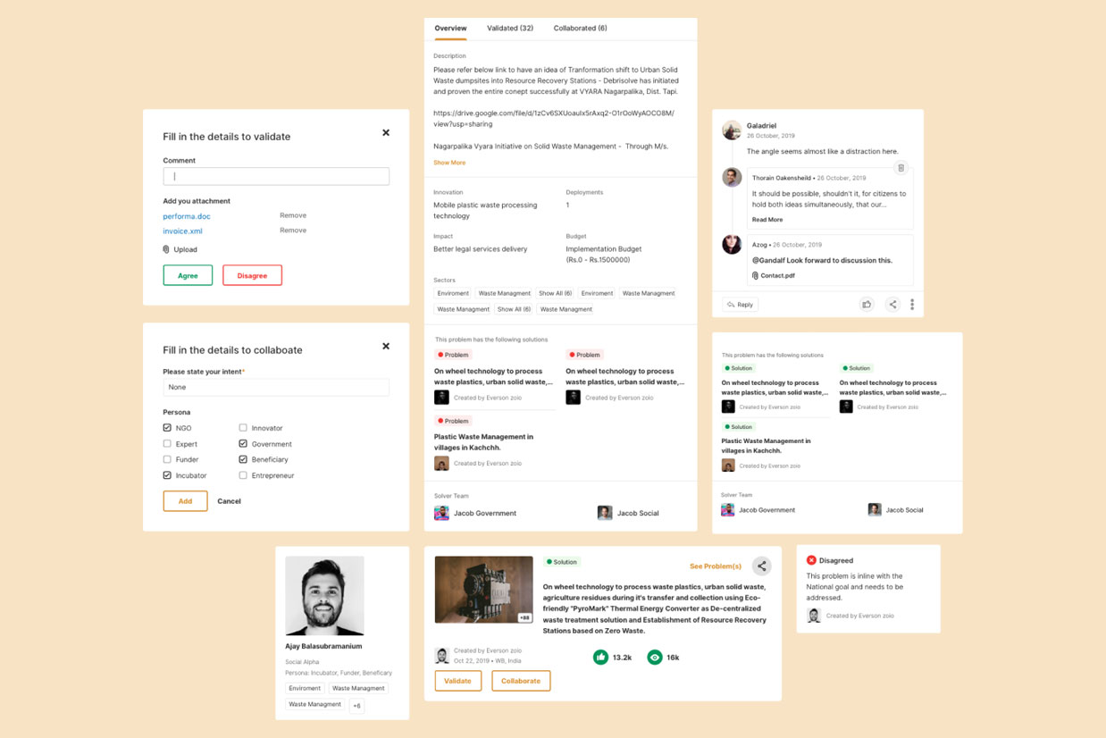
As Social Alpha works with innovators, experts, and investors, efficiency was key. We designed an interface that prioritised essential actions with engaging copy, clear calls-to-action (CTAs), fewer but more purposeful buttons, and well-labelled text. Actions on problem and solution cards, as well as detail pages, were thoughtfully placed for maximum usability.
Intuitive Problem Solving Process
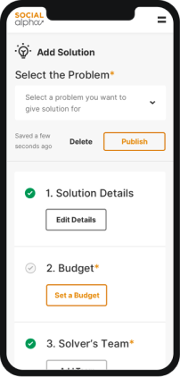
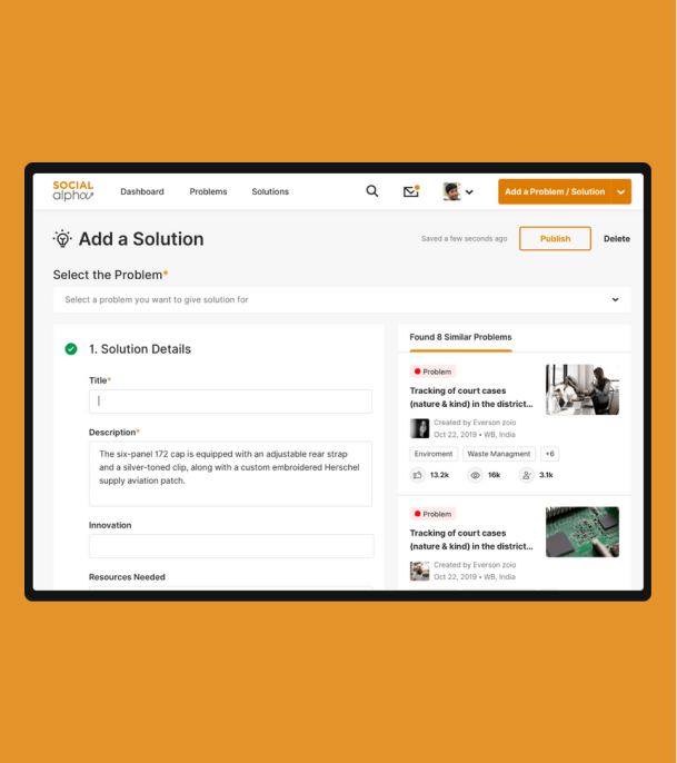
We simplified the process of creating problems and solutions by dividing it into multiple steps. This non-linear approach ensures all necessary information is captured before publishing, making the experience intuitive and user-friendly.

Ensuring Responsiveness
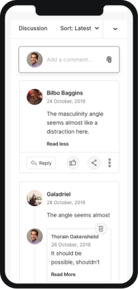
Given the target audience’s dynamic needs, responsiveness was a fundamental requirement. We ensured that essential information is accessible on-the-go, delivering a seamless experience across devices.
Through a thoughtful approach to design and functionality, we partnered with Social Alpha to transform their platform into an intuitive, visually cohesive, and scalable tool, empowering innovators to tackle India’s most pressing challenges.
