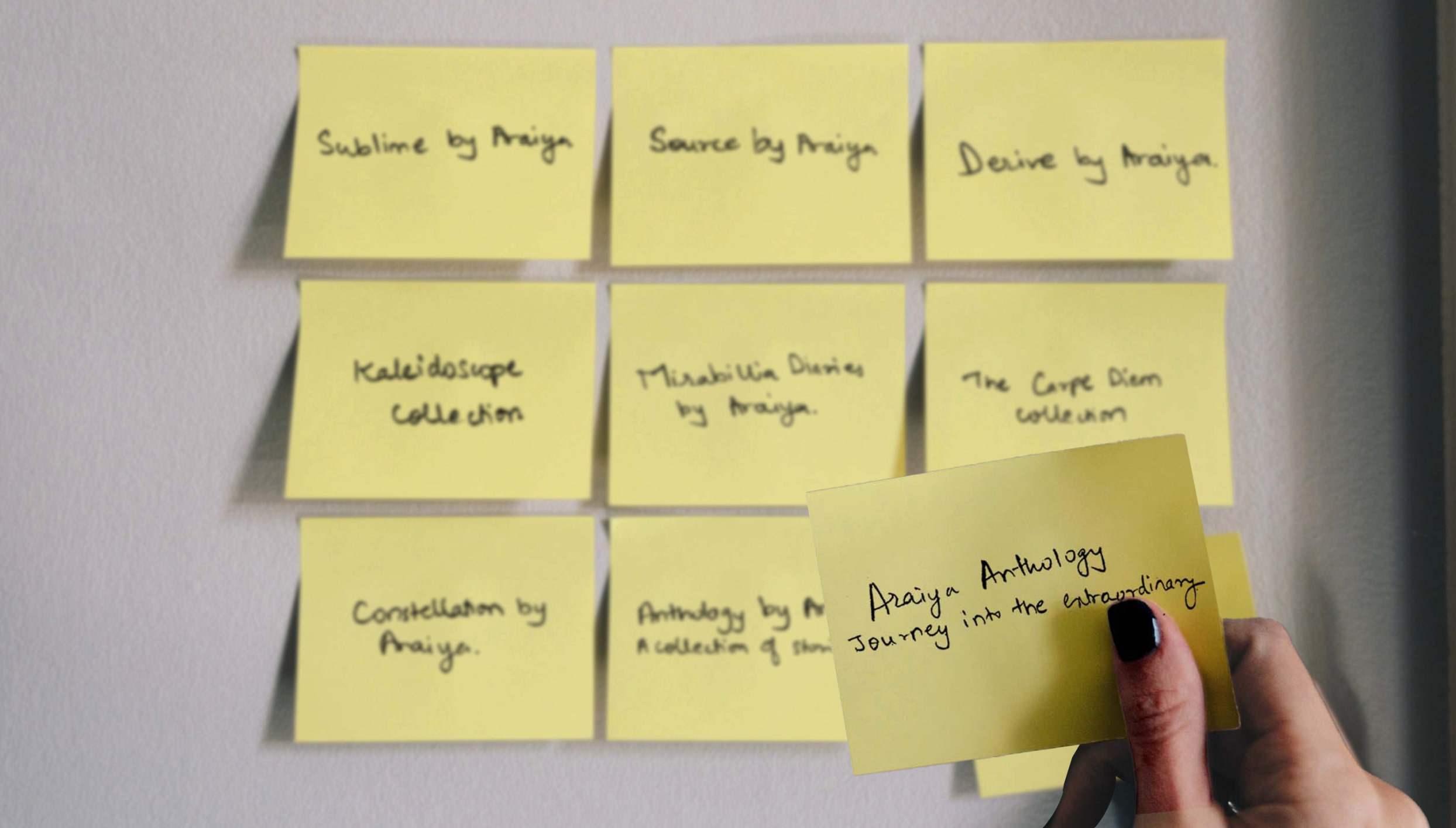
Bokaap Design was approached to create a new travel and hospitality sub-brand for The Araiya Hotels & Resorts.
The new brand was created jointly in collaboration with our strategy partner The Better Collective.
In a post-covid world, many independent boutique properties were seeking to improve their service standards and capabilities to remain relevant to an increasingly discerning traveler and had approached Araiya Hotels and Resorts to take on the management of their guest experience without losing business ownership or compromising the original brand.
The Araiya team wanted to leverage this potential opportunity by converting its exemplary service protocols into a product and lending its brand equity to these independent hotel owners without diluting the essence of its master brand. In turn, Araiya would gain a footprint in new regions and would expand its customer base.
We created a “soft brand” that was in line with brands around the world such as The Autograph Collection by Marriott or The Curio Collection by Hilton. This new brand would be rooted in consumer trends and category differentiation with a distinct value proposition and identity while still allowing for the diversity of the partner hotels within its fold.
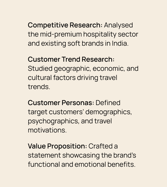
to understand the mid-premium travel and hospitality industry, key players, other hotel soft brands in India and their foundational premise.
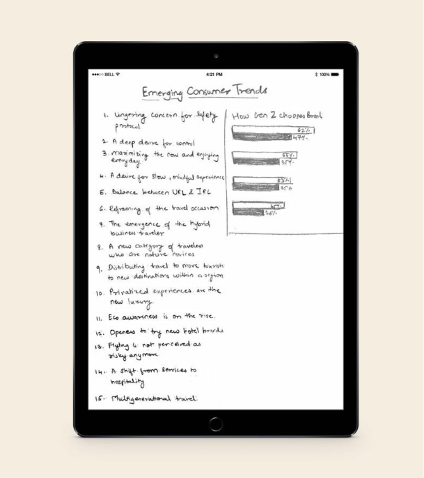
to understand the geographic, economic, cultural and psychological factors that were changing how and why people choose to travel.
developing a detailed understanding of the ideal customer including their demographics, psychographics, lifestyle, beliefs, interests, common objections and aspirations.
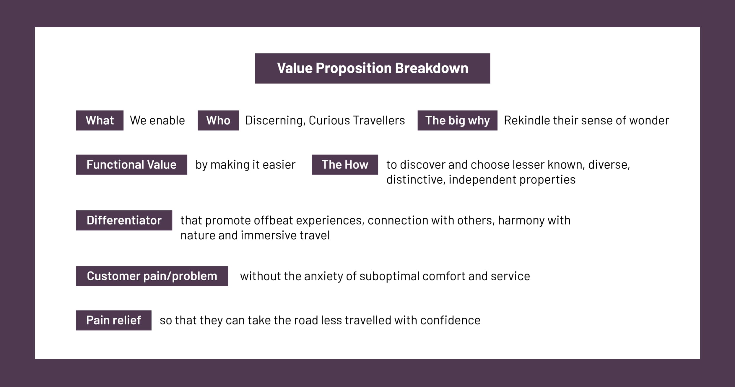
crafting a clear, precise and holistic statement that reflects the soft brand’s value addition in the customer’s lives at a functional, emotional and life changing level.
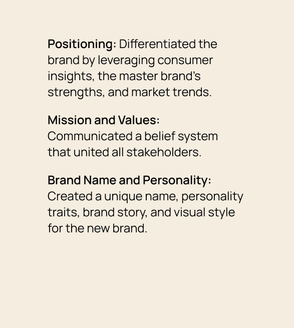
ensuring differentiation and market share by tapping into powerful consumer insights, master brand strengths, and category truths.
communicating a larger goal and belief system that all stakeholders can rally around.
developing a visual vocabulary, name, personality traits, archetype, brand story and verbal style that would become the foundation of the new brand’s identity.
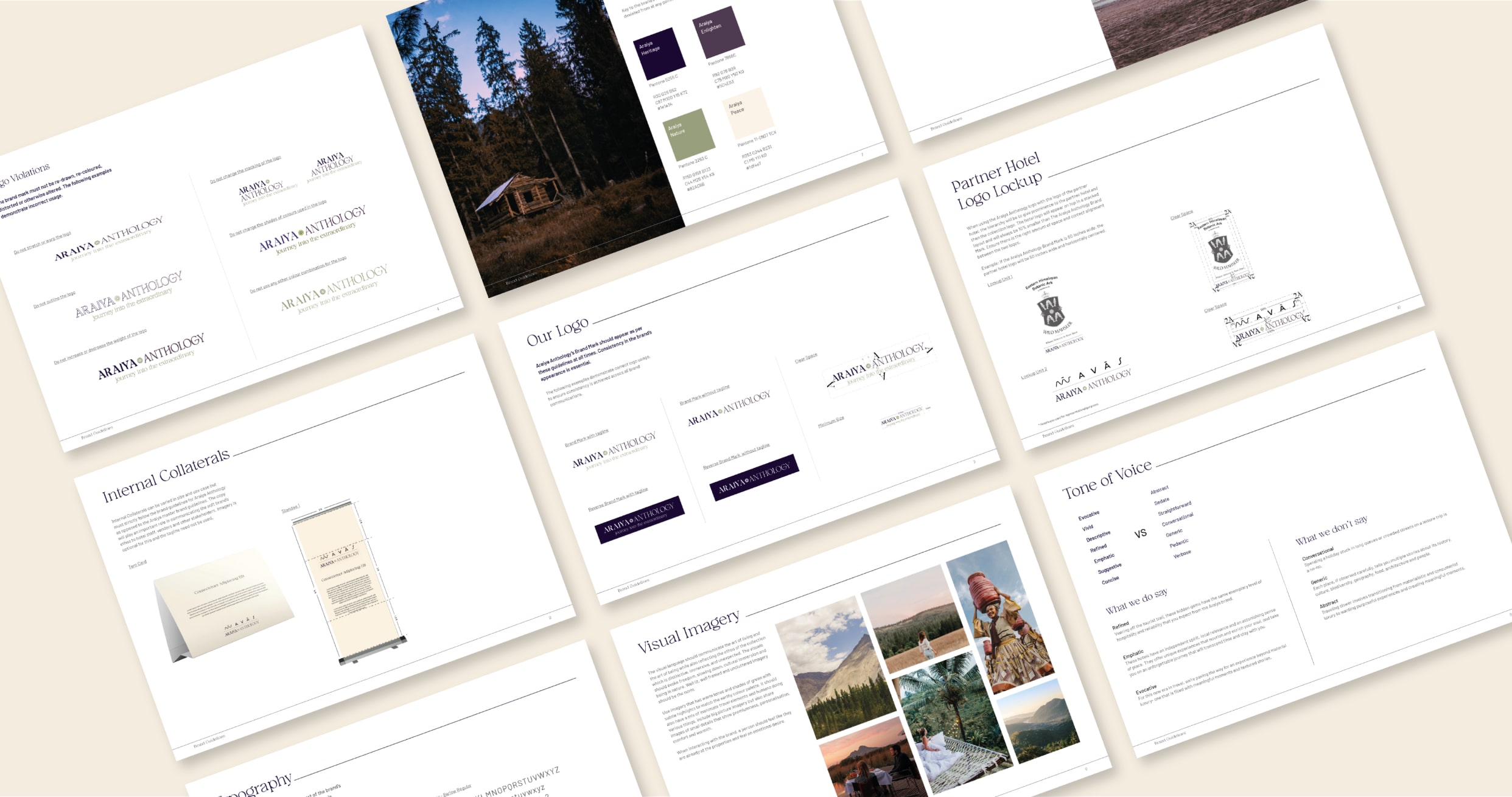
When designing the identity for Araiya Anthology, we had to consider the guidelines of the master brand Araiya. For the essence of the Araiya Anthology, we wanted to showcase both the differences and commonalities within its portfolio. Therefore, we retained the primary colour and the font for Araiya and paired it with a font for Anthology that shows movement to represent travel and storytelling. The secondary colour Green represents nature and active living.The visual language communicates the art of living and the art of being while also reflecting the collection's ethos, which is distinctive, immersive, and unexpected.
Communicating the partnership between Araiya Anthology and the hotels at various hotel branding touchpoints was considered while designing the logo. The logo had to work when paired with the identity of the different partner hotels—each varying in format, structure and colour. To further help the partner hotels, we put together a brand book to guide the new partners on applying the logo across various touchpoints.
“It was a pleasure working with Bokaap Design on the brand strategy and architecture for Araiya Anthology. The thorough research and quick turnarounds allowed us to close the naming and design process in record time. I have full confidence in putting forward Niraali and her team as ideal growth partners.”
-Amruda Nair, Director (Araiya Hotels & Resorts)
The Araiya Anthology was a collaborative project between Bokaap Design and The Better Collective