
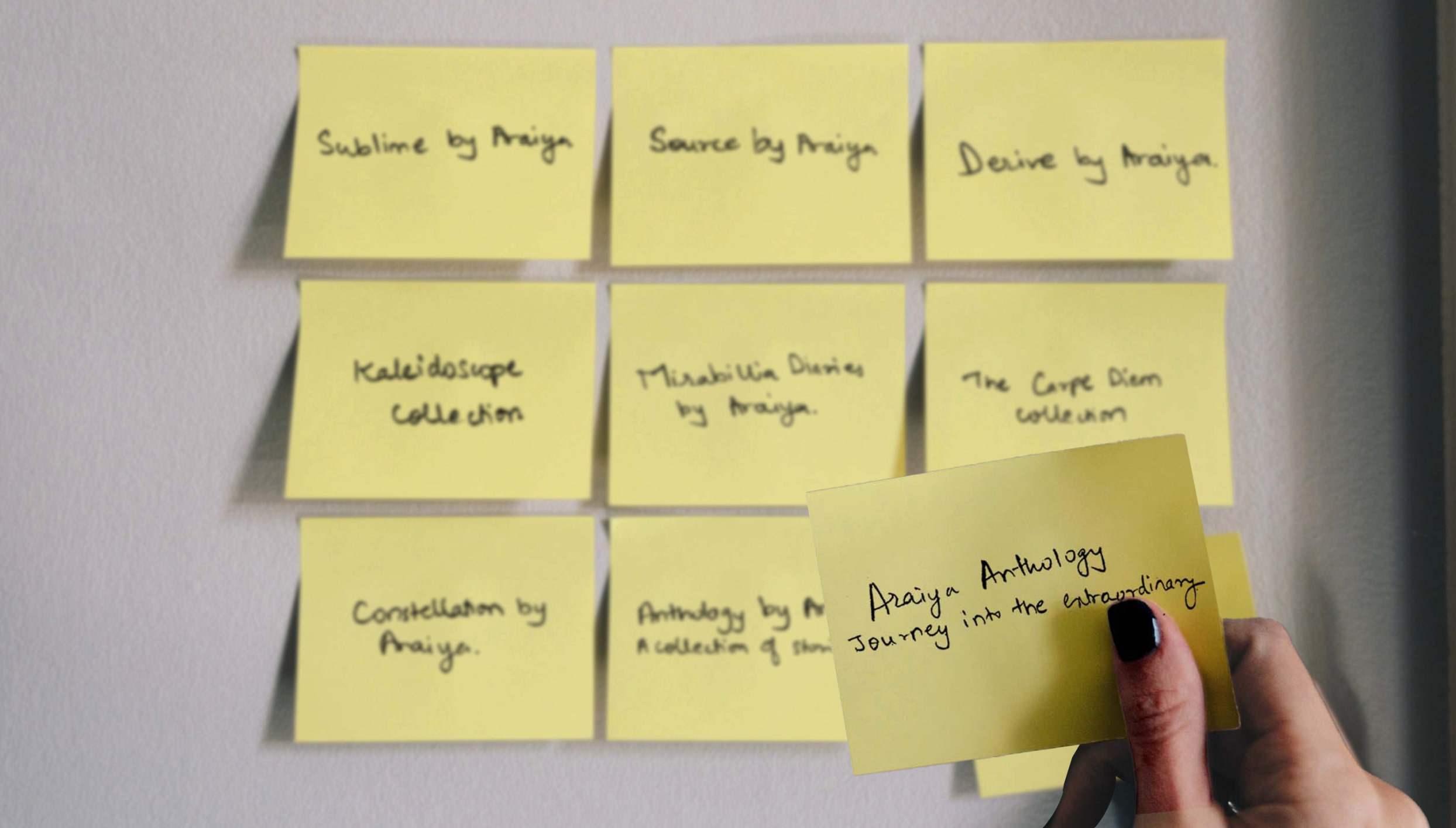
Araiya, led by third-generation hotelier Amruda Nair, tasked Bokaap Design with creating a new sub-brand under The Araiya Hotels & Resorts.
In a post-COVID world, independent boutique properties sought to improve service standards while maintaining brand ownership. They approached Araiya Hotels & Resorts to manage their guest experience without compromising their original identity.
Araiya aimed to convert its service protocols into a product, lending its brand equity to these hotels while expanding its footprint.

We developed a “soft brand,” similar to global examples like Marriott’s Autograph Collection. This allowed diversity among partner hotels while establishing a unified brand identity.
It was a pleasure working with Bokaap Design on the brand strategy and architecture for Araiya Anthology. The thorough research and quick turnarounds allowed us to close the naming and design process in record time. I have full confidence in putting forward Niraali and her team as ideal growth partners.
Amruda Nair, Director (Araiya Hotels & Resorts)
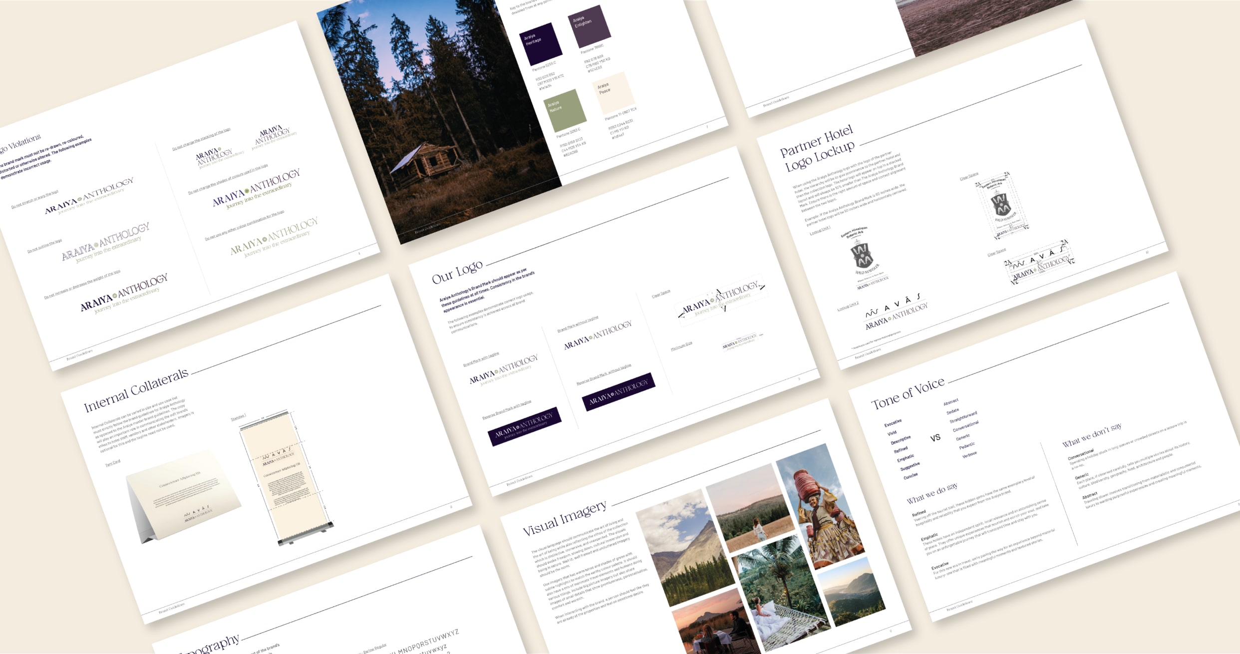
For Araiya Anthology, we respected Araiya’s master brand guidelines by retaining its primary color and font. A secondary font was introduced to represent movement, reflecting travel and storytelling. The color green symbolized nature and active living, while the visual language embodied the ethos of living and being, emphasizing the distinctiveness and immersive nature of the collection.

The Araiya Anthology was a collaborative project between Bokaap Design and The Better Collective

