What We Did
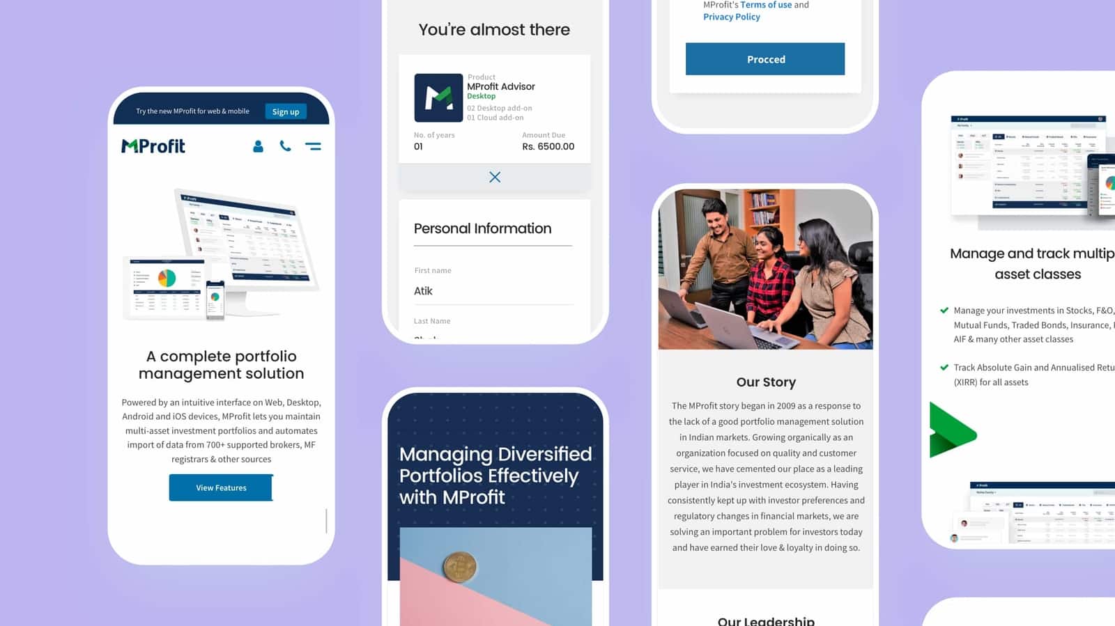
Web and Mobile App UI Design
The Brief
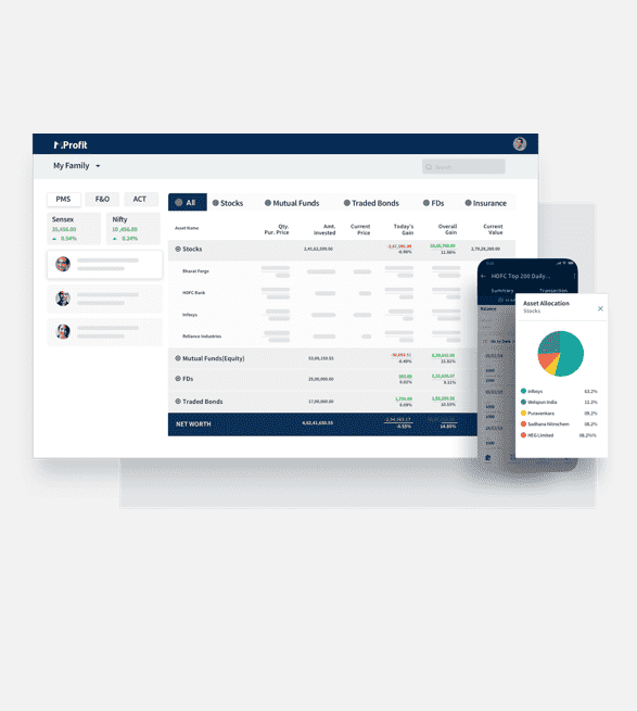
When MProfit launched in 2009, it was a desktop-only software. In 2015, they shifted to a cloud-based model with web and mobile applications.
After launching the cloud app, MProfit sought our help to:
Redefine their brand image in line with their vision of a modern, global finance management system.
Revamp their website to attract new customers and roll out the updated MProfit app.
Create marketing creatives for digital campaigns.
The Process
We conducted workshops with MProfit’s leadership to define the brand’s personality and understand the business goals, customer journey, and pain points.
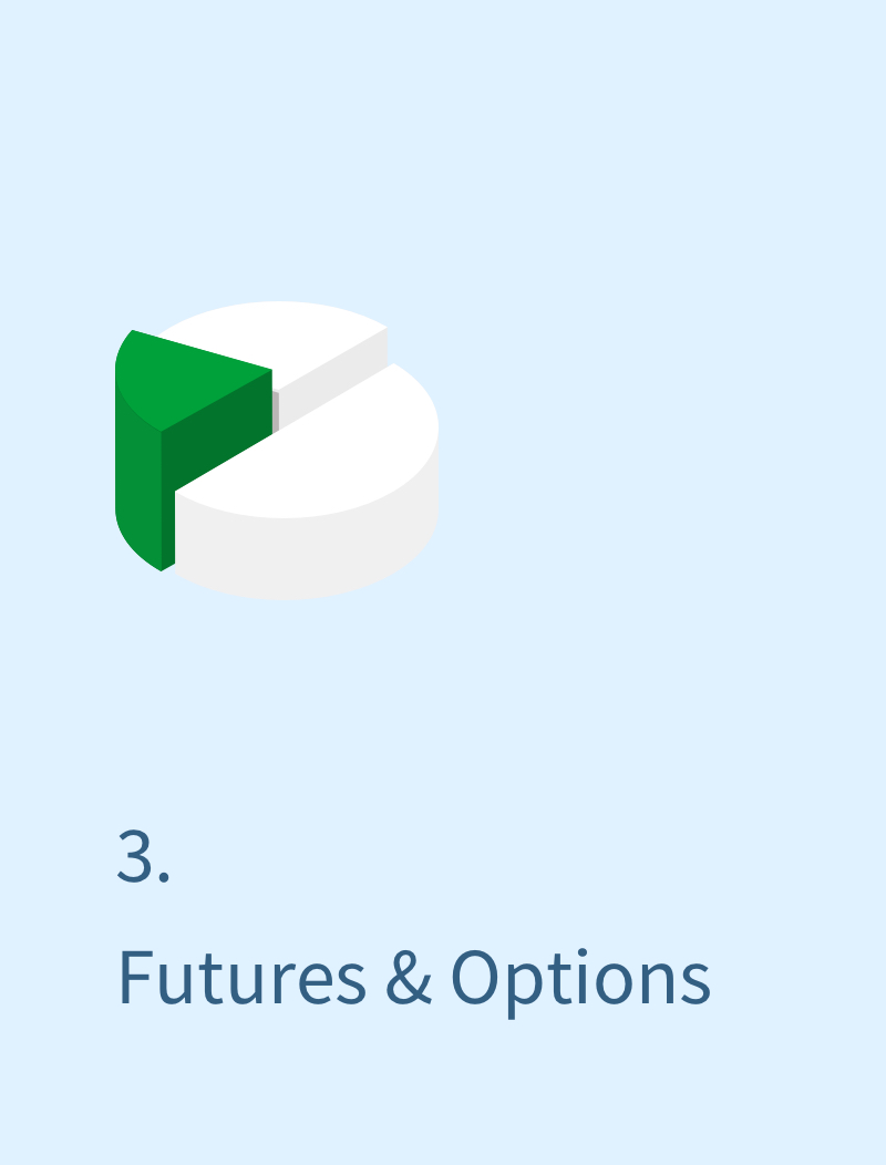
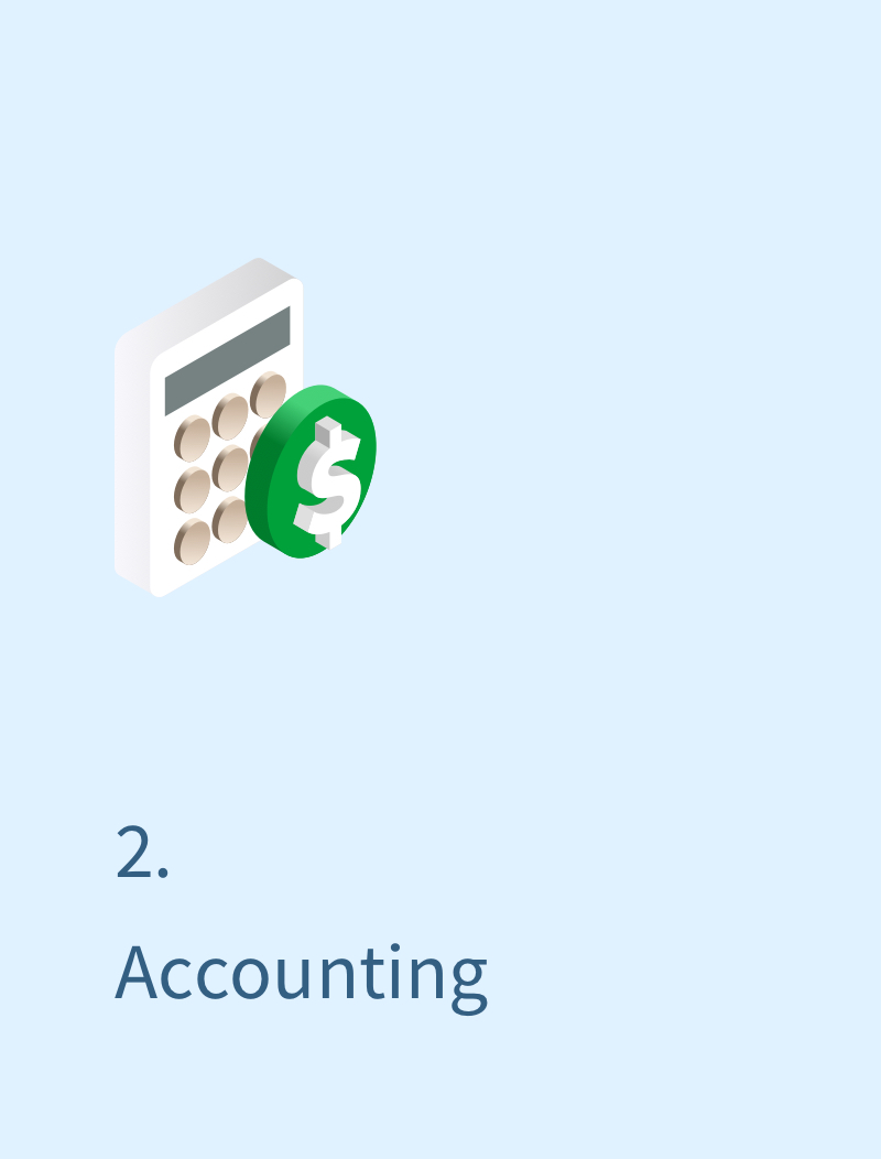
Our competitor analysis revealed that MProfit’s unique selling point (USP) was offering three core services in one platform.
Our experience working with the Bokaap team has been very good. They designed the current MProfit website, the current MProfit logo and the Ul / UX of our app on web + mobile, which we launched in 2018.
We have since also worked with them on updates & improvements to the same. The Bokaap team has good ideas and they are creative. They are also process-oriented and analytical in their approach, always keeping themselves up-to-date with the latest trends in Ul/UX.
Niraali is a hands-on and approachable leader of the team, and it has always been easy to connect with her if we ever needed a more expert opinion on a particular piece of the design. She is passionate about her work and it is very clear that she has built a great working culture at Bokaap.
Overall – I definitely recommend working with the Bokaap team for their creativity, experience and good understanding of modern digital design.
Atik Shah, Co-founder
Brand Identity
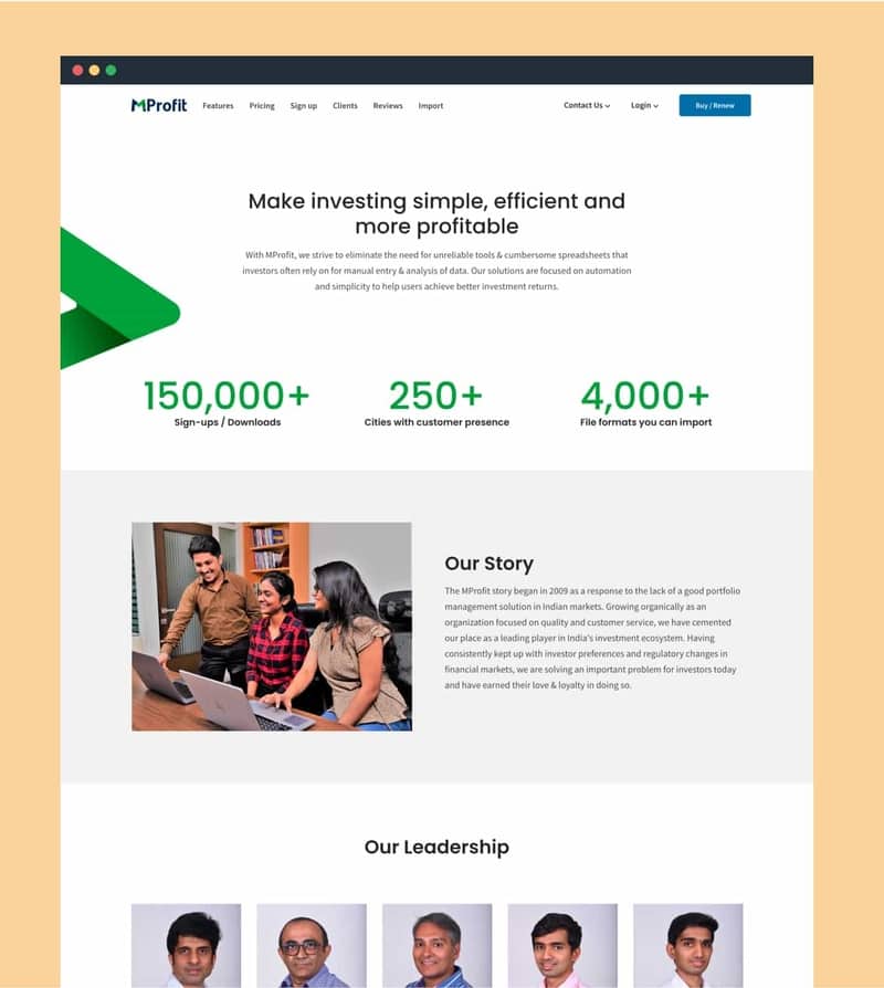
As we worked on the mobile app, we also revamped MProfit’s logo and branding. For the new logo, we customized the typeface to appear condensed, tall, and sharp, with slightly softened edges for a modern yet approachable feel. We retained the familiar blue and green colors, updating the tones for a fresher look. A green arrow was incorporated into the logotype to symbolize financial growth, intended to be the core brand symbol across all collateral.
This updated logo, with the arrow as a key element, was designed to work consistently across platforms, ensuring a cohesive brand identity.
Website Revamp