The existing website had no proper site plan with a poor user experience (UX) and design. When new pages were added, older pages were neither deleted nor updated, so visitors couldn’t find up-to-date information within multiple pages and sub-domains.
At the outset, we knew this would be an enormous task. The college was going through a transition, and they were re-framing their education models. We knew we had to work alongside them to give their internal discussions structure and communicate them to their target audience.
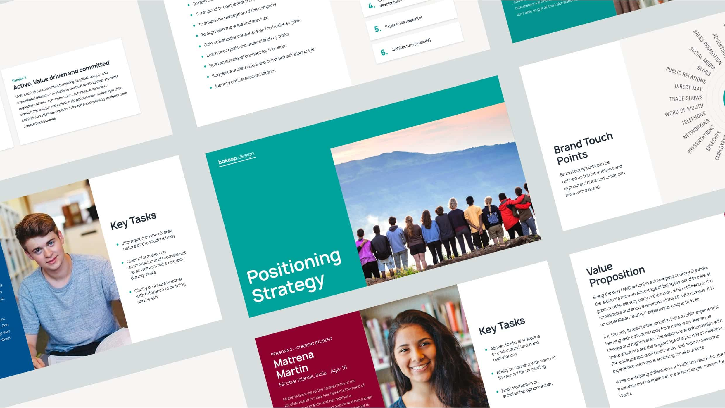
We spent time with the college’s representatives to break down what MUWCI wanted to achieve and what makes it unique and put it together as a new way to position the college. We visited the campus and spoke to students about what they would have liked from the website as applicants, and how their experience compared to the expectations the website set. This gave us an insight into how prospective students perceive the college and what they want to know about it.
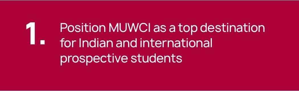
We identified specific goals that the redesigned website should achieve:
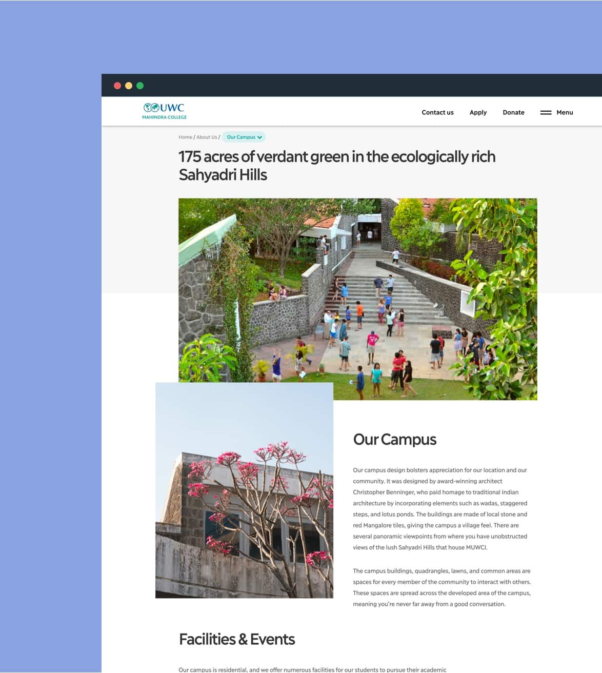
Our core strategy was to emphasise how MUWCI’s location differentiated it from other IB schools (including other UWC schools).MUWCI is in rural India, surrounded by nature. Students live at the grassroots level, interact with residents of the village, and learn about the problems in developing nations first-hand. The written content and visual design elements had to highlight the impact of MUWCI’s location on their educational experience.
Our first step was to identify all the users that the new website would talk to. Given the messaging and information the college wanted to include, we identified a large target audience group. national committees; prospective students and their parents; alumni; donors; prospective faculty and staff; and current students, their parents, faculty, and staff.
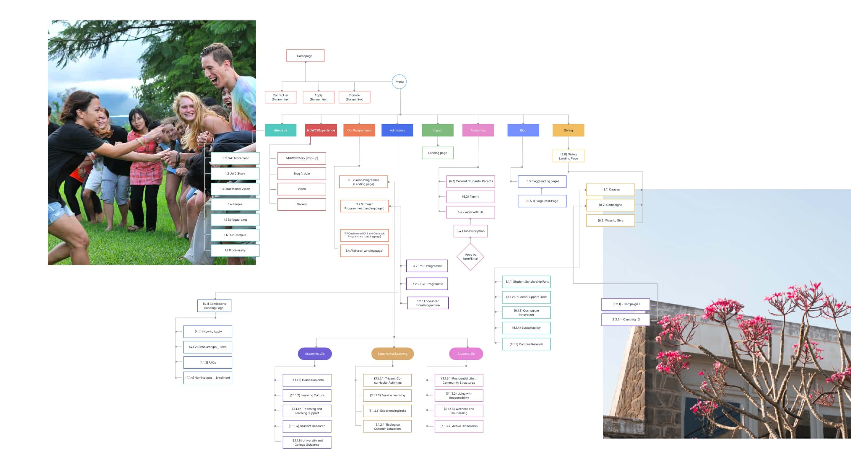
We audited the existing website and created a new sitemap for the content. To create the sitemap, we had to collate raw information from scattered sources such as the student handbook, brochures, videos, and student projects, and verbal communication with college representatives and put these into content verticals.
We had to reorganise information and group relevant content to give it coherence and a flow. It needed to address the identified target audiences and convey what the college has to offer.
There was a lot of information to cover, and it had the potential to overwhelm visitors. The design and content teams worked together at every step to create relevant, visually appealing, and easy-to-find content that was not repetitive.
We developed a great partnership with Bokaap Design over the course of designing our website! They frequently challenged and simplified our ideas using crucial insights gained from experience, and they've helped create a highly functional yet beautiful website that does justice to our school.
There was inconsistent brand messaging. Information that current and prospective students received directly from campus or social media didn’t align with the outdated information on the website. We needed to ensure that, with the new website, there was consistency in brand messaging and brand identity across platforms.
By simplifying the sitemap and identifying specific content buckets, it is now easier for the college to identify when information has become outdated and needs to be replaced.
We had to develop a voice and tone that would speak to both target audiences. Within these parameters, we also had to write for potential students from countries where English is not their first language. We engaged in a lot of debate about the language and tone to use to make the copy easy to understand. We felt this was one area of the content that could be improved, but we ultimately had to write it in the way the client approved.
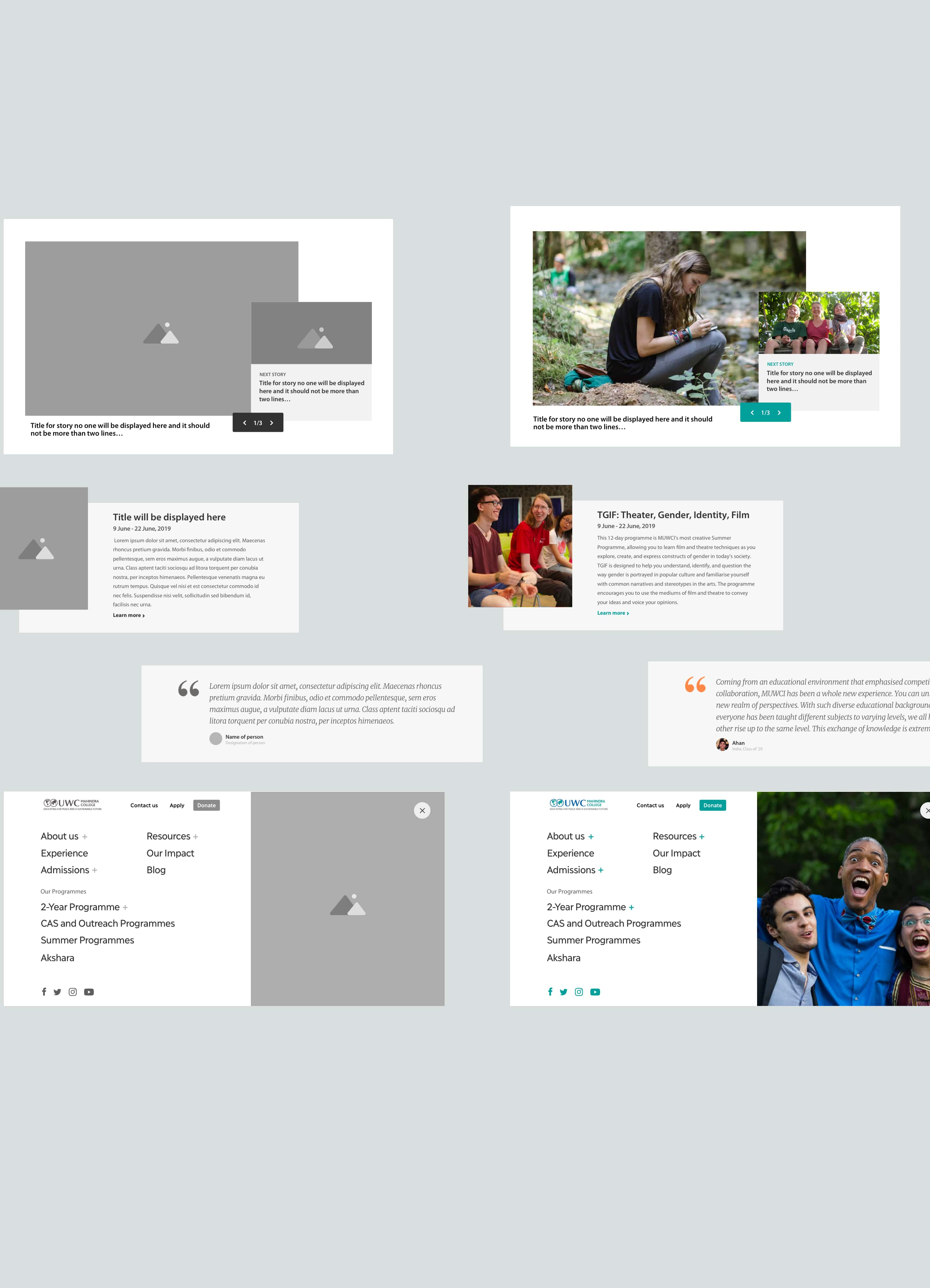
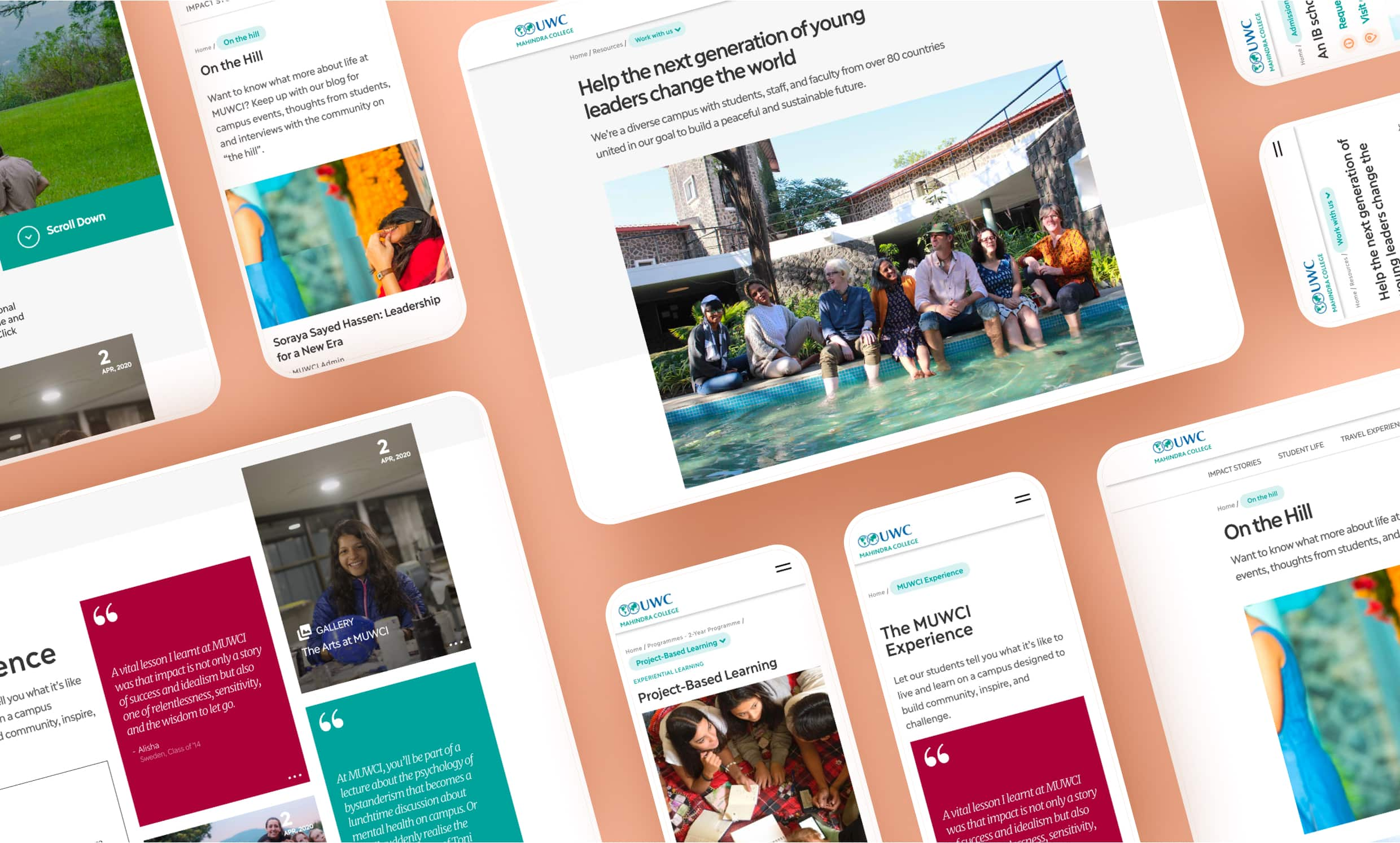
For the wireframes, the design team divided the sections into small modular blocks, which made the design consistent and easy to scale across such a large website.
The wireframe phase was exhaustive, with every page and every written piece of content within a page accounted for in terms of format and flow. This made it easy for us to implement design during the design phase. We changed the brand colours to make them more vibrant. We also updated the font from Myriad Pro to Ilisarniq, which increased readability and gave it a refreshing, modern look.
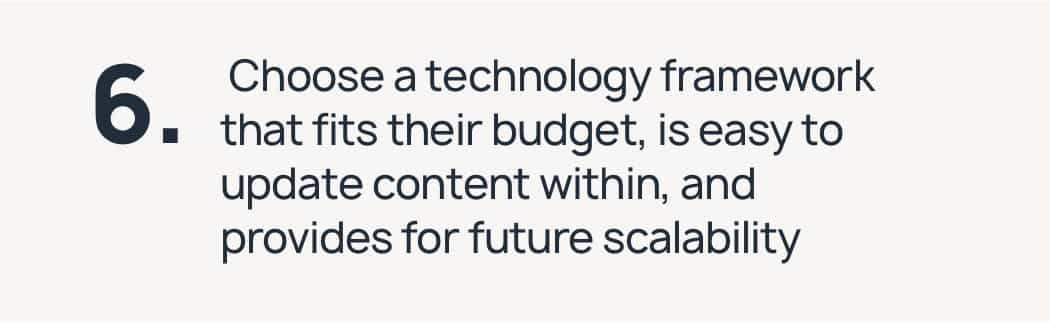
We had to build the back-end within a strict budget that would also support a fully customised user interface and design. To minimise costs, we chose a technology framework that relies on ready plugins that we then manipulated to support the design. We designed the entire website using common modules, so we were able to minimise the number of plugins we needed to build the website and maintain visual consistency.
One of our goals—to balance factual information with the MUWCI experience—was also one of our challenges, since the content was information-heavy. We addressed this issue through three means:
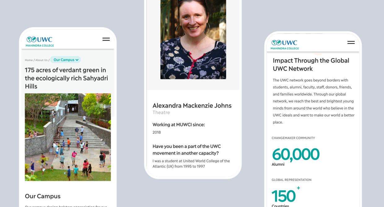
We added lots of photographs and videos of the campus, students, and activities on every page of the website to show life at MUWCI.
We placed quotes from current students across the website so visitors could “hear” directly from students on every page.
We linked to relevant blog posts across the website to give visitors a look into what happens on campus.
We created a page called ‘The MUWCI Experience’, which comprises photos and videos of campus life and articles and quotes from students. Visitors to this page get the MUWCI experience from students with no information from the college.
The project team included two alumnae, one of whom was also a MUWCI staff member. There were many times when we needed to take a step back from the alumnae’s experiences and think about what an outsider would want to know. Two of our team members had no prior affiliation to MUWCI, and these team members helped maintain distance and objectivity and ask clarifying questions.
The redesigned MUWCI website is visually, informationally, and experientially rich. It speaks to all the target audience groups without repeating itself or making the information hard to find. Our new content structure and sitemap have fixed the issues that created a frustrating experience for visitors.